Whether it’s a shocking hair cut or a change of fashion sense, most 20-year old’s go through a transformation. Having just turned 20 ourselves, Liftshare didn’t want to avoid its own glow-up.
We’ve come a long way in those 20 years, from a post-it note on a student-notice board to a suite of digital products to help the UK to #TravelHappy. In the years leading up to 2020, we’re aiming to innovate our products even more, leading the way in sustainable transport – with a renewed vigour of mission, we want our brand to match.
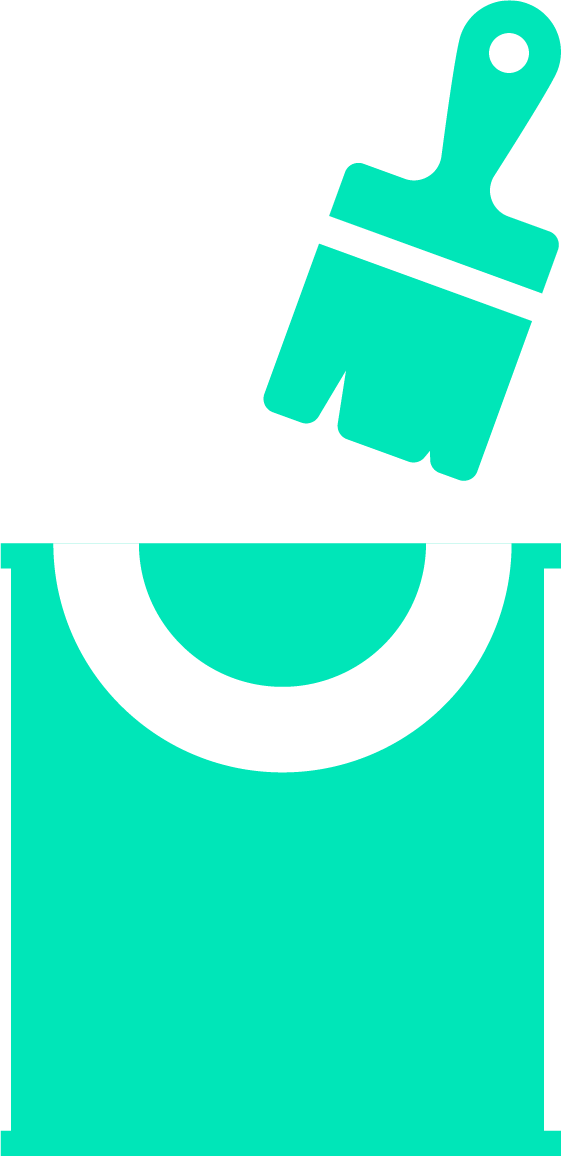
From this…
![]()
To this…
We started our project to evolutionise Liftshare’s brand by working with Cubo, a creative agency who have worked with brands such as the Youth Hostel Association, De Montfort University and the Crown Commercial Service. Much like Liftshare, Cubo believe in putting people first, and so they work-shopped with the entire Liftshare team to uncover what Liftshare means to us, as well as doing some external research, to help us build our refreshed brand story and mission statement.
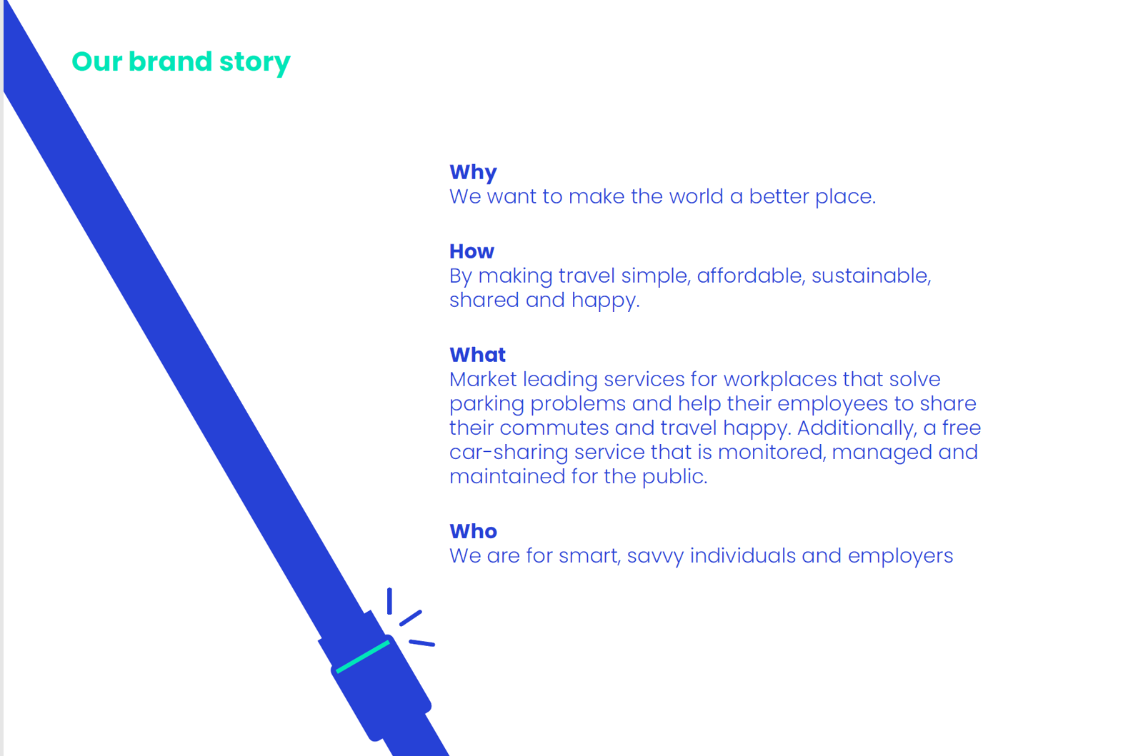
We now have a clearer ‘Why’, ‘How’, ‘What’ and ‘Who’ to help underpin all the work we do in achieving our business goals and objectives in turn, making travel simple, affordable, sustainable, shared and happy, because Liftshare want to make the world a better place. In short, we want to give everyone the opportunity to Travel Happy.
From our clear brand story and mission, we were then able to work with local design agency, Ark (so local their office is 350 feet away, and yes, we did have many face to face meetings!) to update or logo, colours, font, and image.
Ark took our previous and existing logos and our refreshed brand story, and worked with us to produce 3 versions of our logo, look and feel: an evolution, revolution and a completely new identity. Keen to keep our Liftshare smile and after consulting the wider team, we opted for the evolution:
You’ll notice that Liftshare Business is now Liftshare for Work – we feel that this better reflects the service we provide to our clients.
Our new font is the bold Poppins, which really helps to catch the eye, and our colours are a richer blue and green than before.
Then and now
With our rebrand, comes a refresh of Liftshare.com and the Liftshare Dashboard.
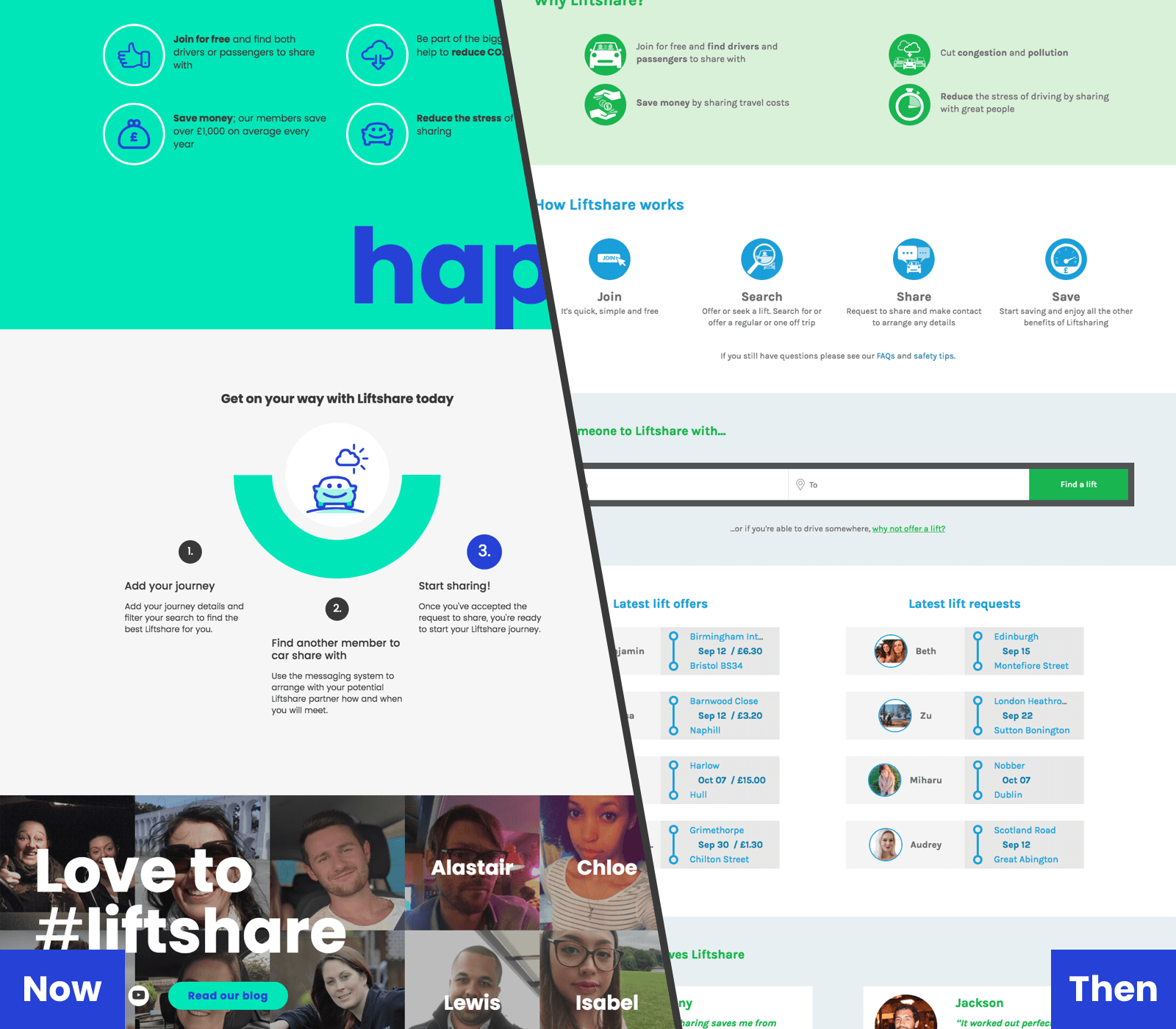
The new look liftshare.com
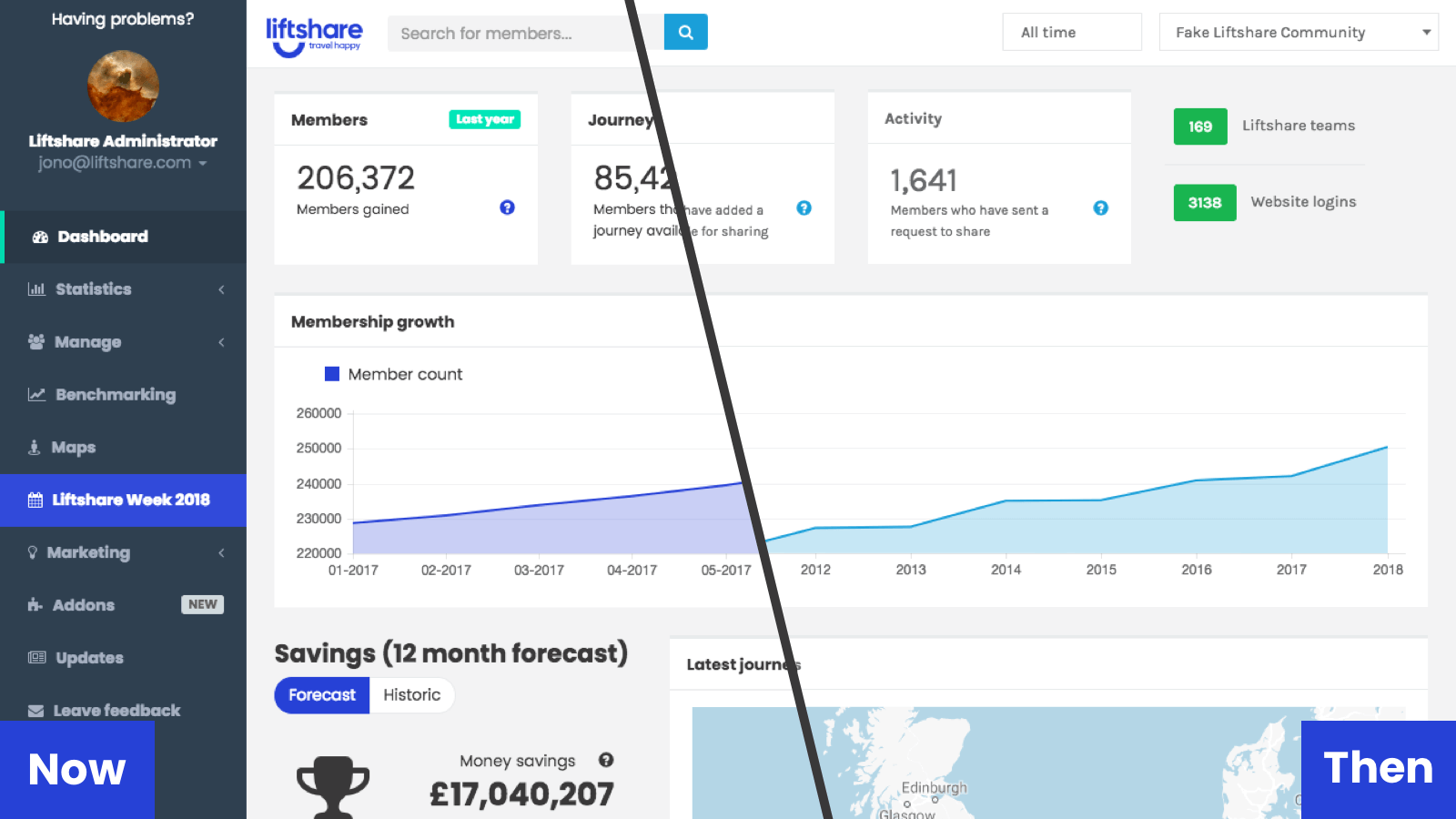
Our new-look Dashboard features updated colours and smoother lines.
Liftshare Communities won’t see much difference, except where our logos are featured.
Development of the Dashboard won’t stop at it’s colours, we’re also undergoing a review of the information we display to our clients, to ensure your experience with the Dashboard is the best it can be.
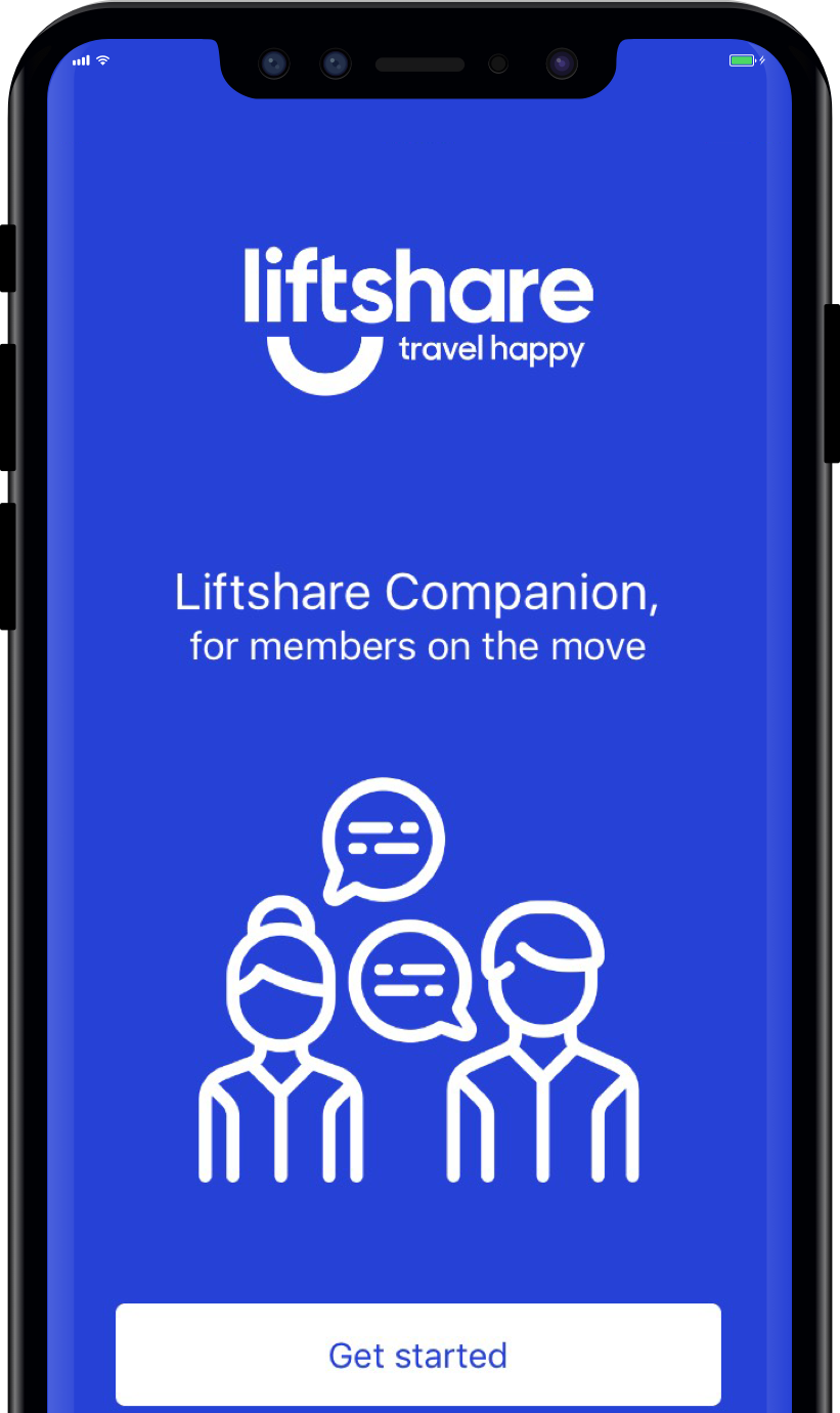
You’ll also notice updates to the colours and fonts on our app:
We’d love to hear your thoughts on our new look. Contact us via Twitter, Facebook and Linkedin, or drop our Membership, Campaigns and Communication Manager, Laura an email.
Author Laura Watling
on
You might also like…


Car share for less with Liftshare, the UK’s biggest sharing economy site!
Join now!